Retail juggernaut Walmart updated its logo with a design change that left people scratching their heads after its grand reveal.
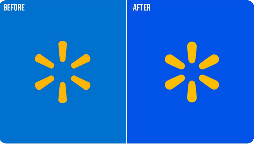
The superstore previously sported a yellow spike mark at the end of its "wordmark" for the word "Walmart," featuring six evenly spaced spokes or "sparklets."
The rebranded logo now features…six evenly spaced "sparklets," but slightly altered—maybe not enough for shoppers to notice a distinction between the former design and the new design unless they see them side by side.
Here's a study of contrasts, so to speak.
See the difference?
They also shared their new font, which is basically just slightly bolder:
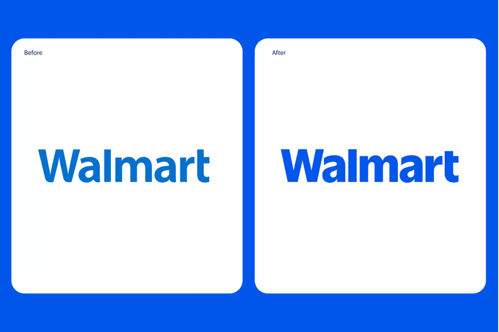
Keen observers may notice the general aesthetic is the same except for slighter wider yellow spokes and a more vibrant color palette Walmart's website describes as "True Blue and Spark Yellow."
In its announcement on January 13, Walmart stated they were excited to unveil a "comprehensive brand refresh" to reflect "its evolution as a people-led, tech-powered omnichannel retailer."
As part of the giant box store's "brand refresh," it noted that the "Walmart" wordmark was inspired by "Sam Walton’s classic trucker hat" and "brought to life with a modern, custom font that differentiates Walmart from the crowd."
They also said the yellow spark "exudes the energy of Walmart" and acts as "a beacon that guides customers through all facets of the Walmart experience."
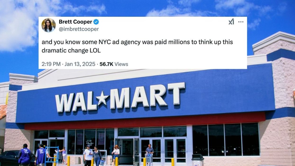
While that's all well and good, social media users mocked Walmart with their own compare-and-contrast examples.
Walmart continued being mocked for basically staying the same.
There was plenty of sarcasm in stock.
Walmart's senior vice president and Chief Marketing Officer, William White, said in the company statement:
“Walmart aims to be an inspirational, digital retailer that provides all the products, brands and services our customers need and want."
"This update, rooted in the legacy of our founder, Sam Walton, demonstrates our evolving capabilities and longstanding commitment to serve our customers of today and tomorrow."
“While the look and feel of our brand is more contemporary, our refreshed brand identity reflects Walmart’s enduring commitment to both Sam’s principles and serving our customers however they need us."
"As our customers evolve, we will too. Our Walmart will always be their Walmart, and our brand will always be a testament to how we innovate and change alongside them.”
For its rollout strategy, Walmart said the refreshed brand will take place across "various channels and customer touchpoints, from its website and app to its stores and new Home Office opening in Bentonville, Arkansas, in January 2025."
The rollout process began in October 2024 starting with Store 4108 in Springdale, Arkansas. The company said the refreshed brand will continue to be redesigned throughout remaining store locations over time.
As for whether or not your local Walmart got a facelift, particularly with that yellow starburst design, that would be up for shoppers to decide.



 @KBN/Instagram
  @pannchoa/X
 @KFloopNet/X
 @KFloopNet/X
 @KFloopNet/X
 @KpopInsider/X
 reply to @xxxibgdrgn/Instagram
 reply to @xxxibgdrgn/Instagram
 reply to @xxxibgdrgn/Instagram
 reply to @xxxibgdrgn/Instagram
 reply to @xxxibgdrgn/Instagram
 @hh.azzy/Instagram
 reply to @hh.azzy/Instagram
 reply to @hh.azzy/Instagram
 reply to @hh.azzy/Instagram
 reply to @hh.azzy/Instagram
 reply to @hh.azzy/Instagram
 reply to @hh.azzy/Instagram
 reply to @hh.azzy/Instagram
 reply to @hh.azzy/Instagram
 reply to @hh.azzy/Instagram
 reply to @xxxibgdrgn/Instagram
 reply to @xxxibgdrgn/Instagram
 reply to @xxxibgdrgn/Instagram
 reply to @xxxibgdrgn/Instagram
 reply to @xxxibgdrgn/Instagram
 reply to @xxxibgdrgn/Instagram
 reply to @xxxibgdrgn/Instagram
 reply to @xxxibgdrgn/Instagram
 reply to @xxxibgdrgn/Instagram


 @realDonaldTrump/Truth Social
 @WhiteHouse/X