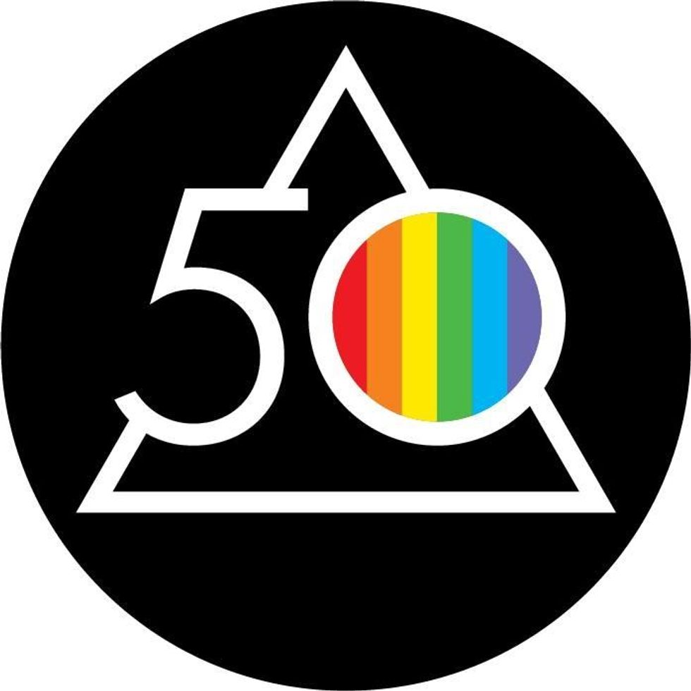
Conservatives lashed out after legendary rock band Pink Floyd unveiled their new social media logo because it has a rainbow in it.
It commemorates the 50th anniversary of The Dark Side of the Moon.
The band updated their logo on Thursday, January 19.
You can see it below.

Conservative critics suggested the band had gone "woke."
Although the sarcasm was sometimes difficult to discern from the actual outrage.


Many whose public profiles' homophobia matched their comments found themselves in a minority of public opinions on Pink Floyd's post.
For the truly outraged, mockery awaited.


The really outraged suggested the logo had an underlying social message.
Why?
Because the rainbow flag is a symbol of the LGBTQ+ community.
Their responses were rather odd when you consider what the original album cover art for The Dark Side of the Moon looks like.
\u201c@travisakers Have they never seen the original album cover? \ud83e\udd26\u200d\u2640\ufe0f\u201d— Travis Akers (@Travis Akers) 1674184889
And as others pointed out, it appears conservative fans of the band have taken the lyric "We don't need no education"—the opening to the band's hit song "Another Brick in the Wall"—a little too seriously.
\u201cPink Floyd fans who really embraced \u201cWe don\u2019t need no education.\u201d\u201d— Tom Taylor (@Tom Taylor) 1674222584
\u201cAre these real? They can\u2019t be real\u2026can they? Are people really mad about #PinkFloyd using a rainbow \ud83c\udf08 for the #DSOTM50 Box Set?\nIf they\u2019re real I guess they took the \u201cwe don\u2019t need no education\u201d thing way to seriously!!!\u201d— Brian Fitzgerald (@Brian Fitzgerald) 1674230801
\u201c"We don't need no education" has never hit home harder....\nThese are the same people who ask when Rage Against the Machine got so political.\u201d— Bitch Pudding (@Bitch Pudding) 1674234289
The Dark Side of the Moon's album art depicts a prism and light spectrum designed by graphic designer and artist Storm Thorgerson in response to keyboardist Richard Wright's request for a "simple and bold" design which would represent the band's lighting and the album's themes, which include conflict, greed, time, death and mental illness.
The design was inspired by a photograph of a prism with a light beam projected through it that Thorgerson found in a photography book, as well as by album cover inventor Alex Steinweiss' illustration for the New York Philharmonic's 1942 performance of Ludwig van Beethoven's Emperor Concerto.
The album's design is ranked among the most recognizable album cover art in history.
Thorgerson said in an interview with Rolling Stone the cover art was meant to represent the quintessential light show often part of Pink Floyd's concerts.


 @PreetBharara/X
 @RepBrendanBoyle/X
 @twesq/Bluesky
 @christopherharris/Bluesky
 @evangelinewarren/X


 @FrankC164/X
 AMC
AMC