
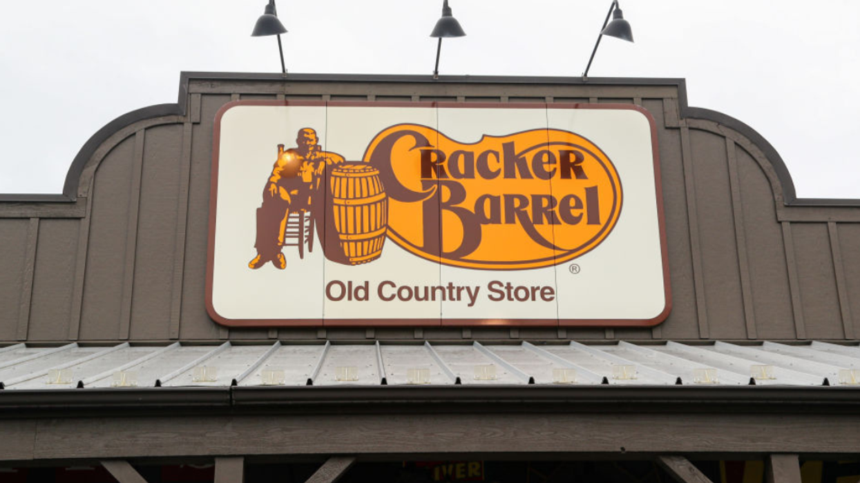

The Cracker Barrel restaurant chain sparked backlash from conservatives after it debuted a new look for its logo, removing the seated man and the barrel from its logo after 48 years.
Cracker Barrel's new logo drops its long-standing backdrop in favor of a yellow, hexagon-like shape with the brand’s name in bold text. The redesign marks the most significant change since 1977, when Nashville designer Bill Holley sketched the original logo on a napkin, featuring an overall-clad “old-timer” meant to evoke nostalgia.
The logo has undergone minor tweaks over the years, but the latest update eliminates the pinto bean-shaped backdrop, once a nod to the chain’s early menu.
The far-right X account @EndWokeness got the ball rolling with the following melodramatic message:
"Cracker Barrel has fallen."
You can see the post below.
And of course other conservatives ate it up—no pun intended.
Others—including Donald Trump Jr.—also piled on.
But many pointed out that this was yet another silly manufactured controversy and mocked the conservative outrage.
Add this to the giant file of weird things conservatives are losing their minds over.
Last month, right-wingers criticized toymaker Mattel after the company introduced a new Barbie doll with Type 1 diabetes, including an insulin pump and blood sugar tracker—an action they say is "woke" while not understanding the difference between Type 1 and Type 2 diabetes.
Angry conservatives didn't appreciate the gesture and lashed out, appearing not to know that Type 1 and Type 2 diabetes have different causes.
But we're talking about the same group of people who also once attacked the legendary rock band Pink Floyd after its members unveiled a new social media logo that happens to have a rainbow in it. The change was made to commemorate the 50th anniversary of The Dark Side of the Moon.
The backlash was odd considering The Dark Side of the Moon's album art already depicts a prism and light spectrum designed by graphic designer and artist Storm Thorgerson in response to keyboardist Richard Wright's request for a "simple and bold" design that would represent the band's lighting and the album's themes, which include conflict, greed, time, death and mental illness.
But we suppose that's "woke" too at this point.

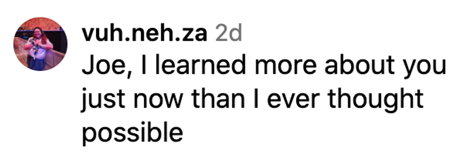 @vuh.neh.za/Instagram
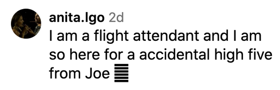 @anita.Igo/Instagram
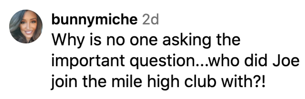 @bunnymiche/Instagram
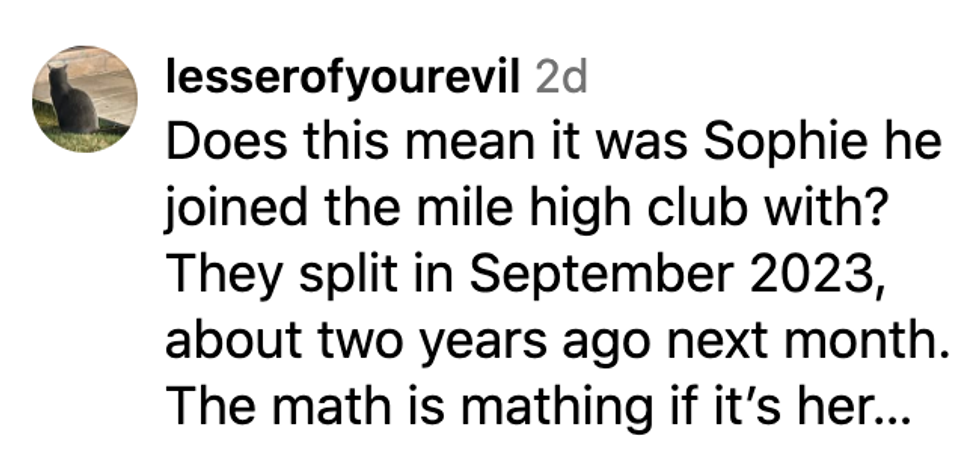 @lesserofyourevil/Instagram
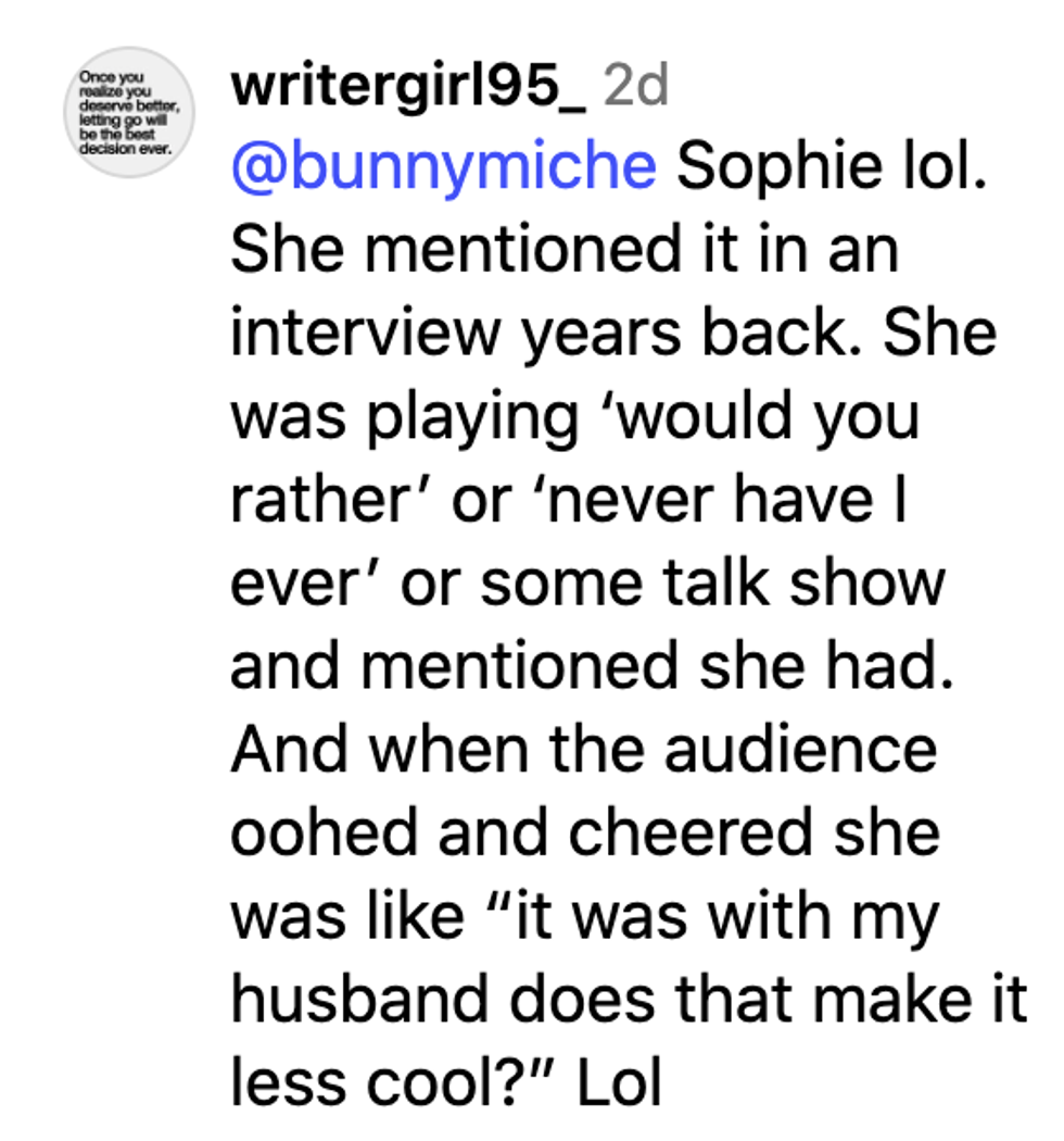 @writergirl95_/Instagram
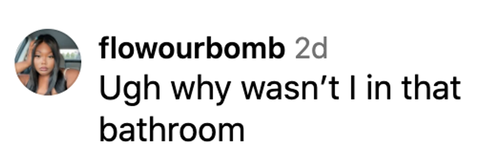 @flowourbomb/Instagram
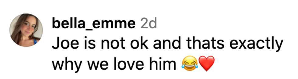 @bella_emme/Instagram
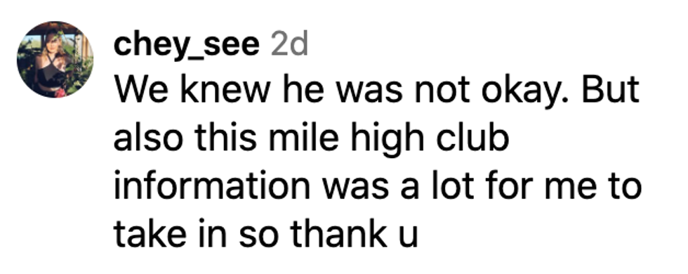 @chey-see/Instagram
 @m.aya.d/Instagram
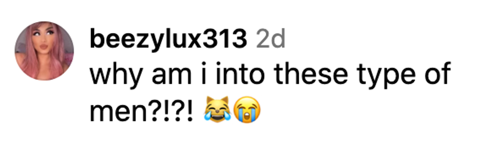 @beezylux313/Instagram

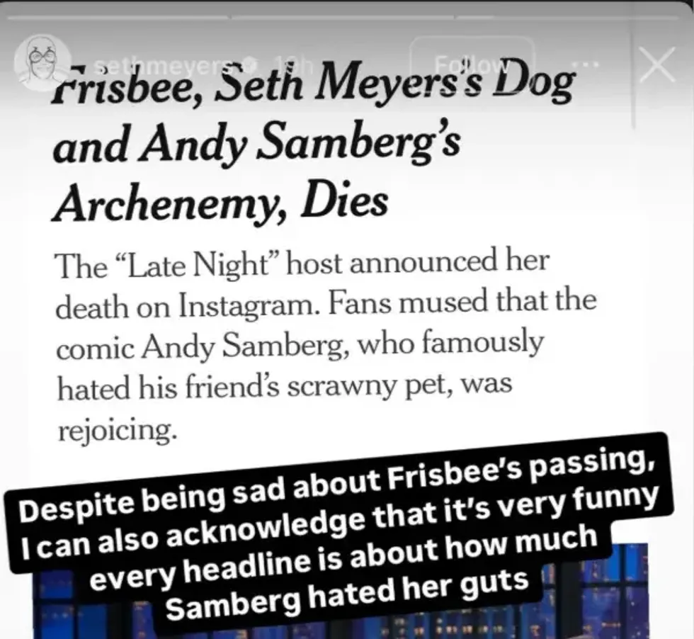 @sethmeyers/Instagram
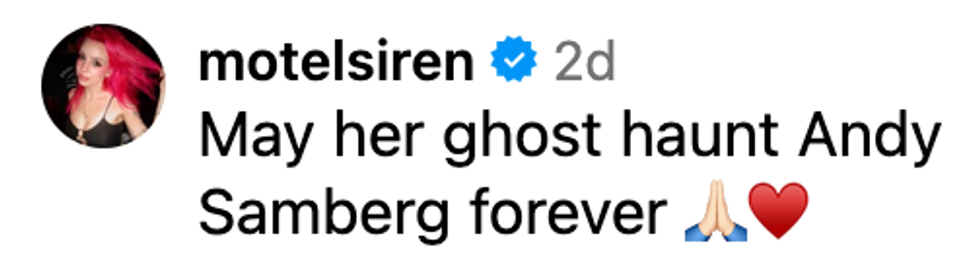 @motelsiren/Instagram
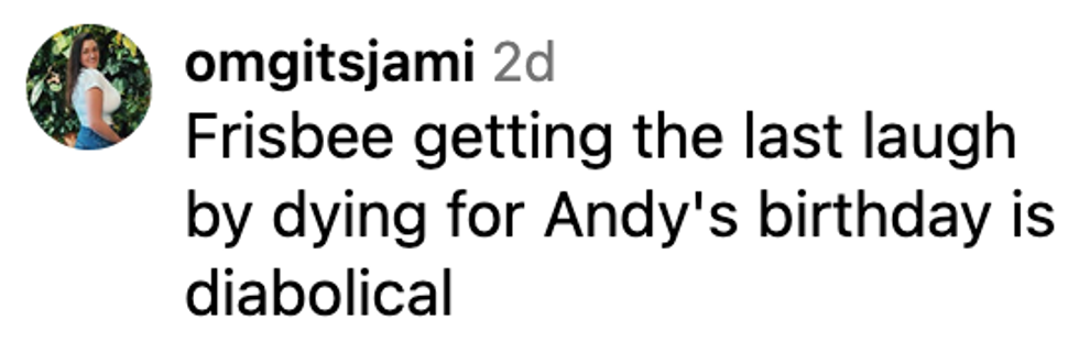 @omgitsjami/Instagram
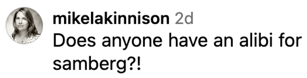 @mikelakinnison/Instagram
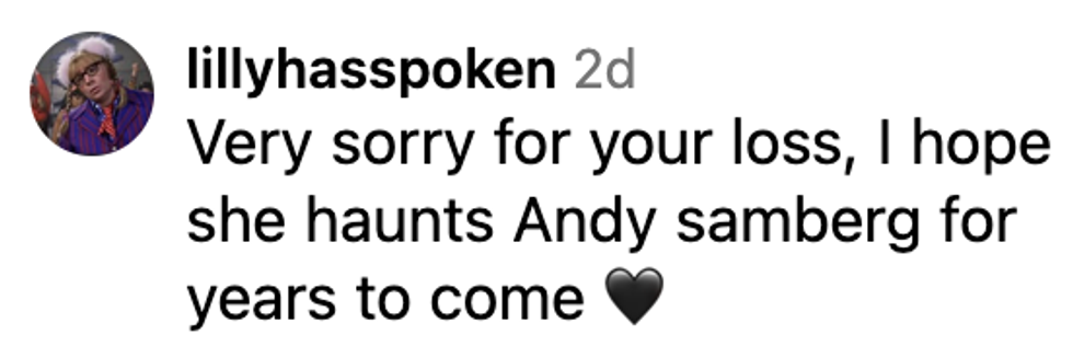 @lillyhasspoken/Instagram
 @ahistoryofdogs/Instagram
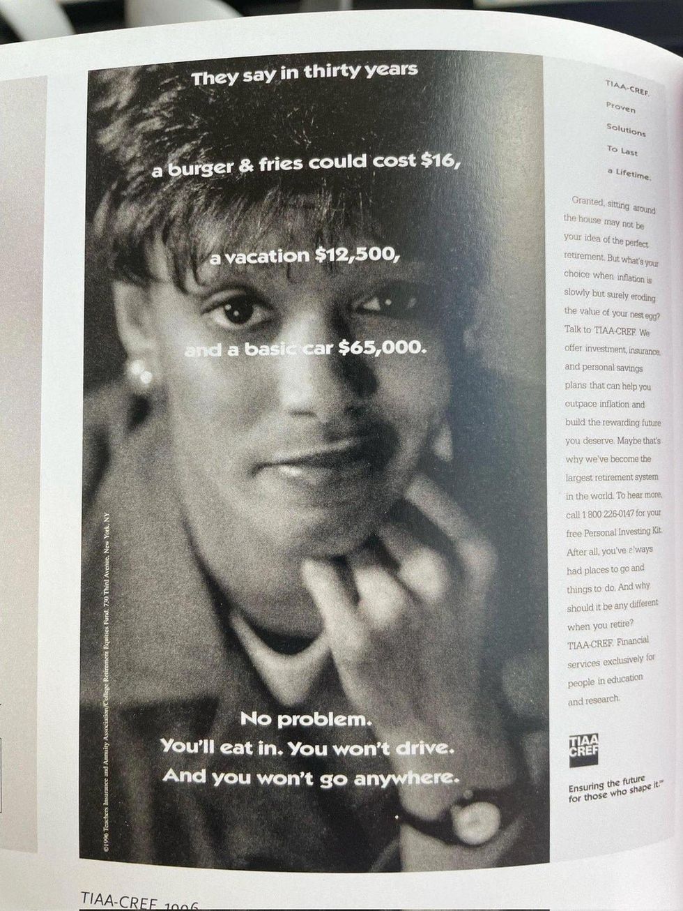 r/Damnthatsinteresting/Reddit
 @PoorlyAgedStuff/X
 r/Damnthatsinteresting/Reddit
 r/Damnthatsinteresting/Reddit
 @Iamrt616/Instagram
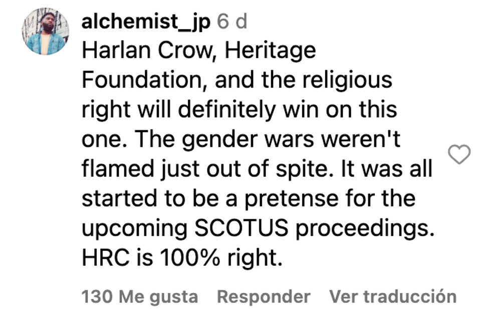 @alchemist_jp/Instagram
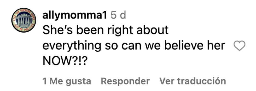 @allymomma1/Instagram
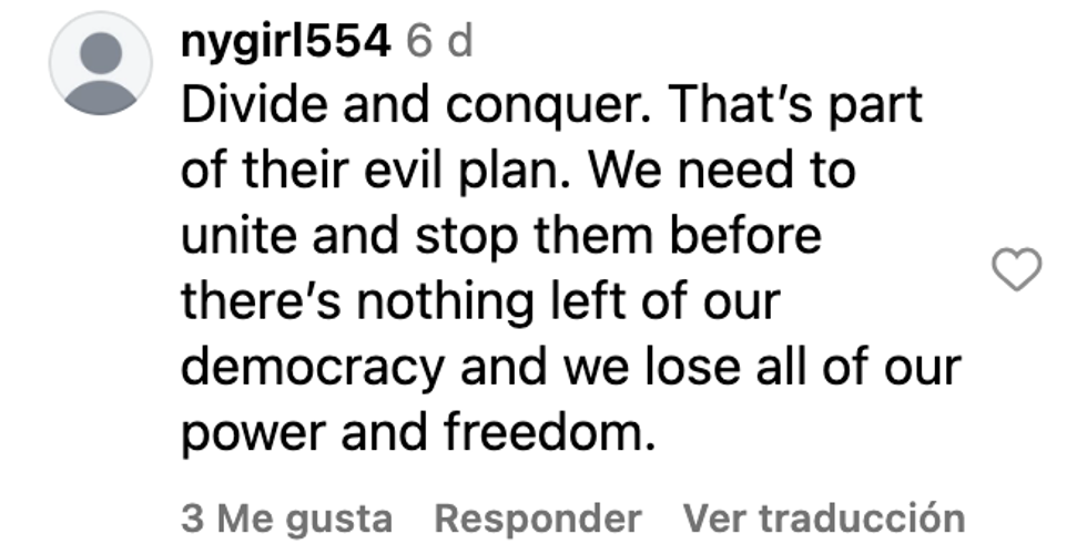 @nygirl554/Instagram
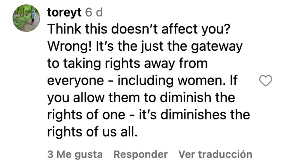 @toreyt/Instagram
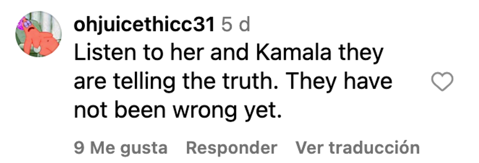 @ohjuicethicc31/Instagram
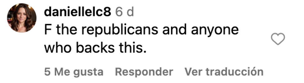 @daniellelc8/Instagram
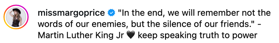 @missmargoprice/Instagram
 @meghannaschense/Instagram
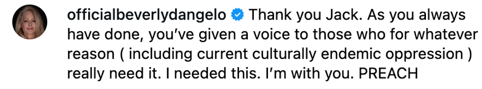 @officialbeverlydangelo/Instagram
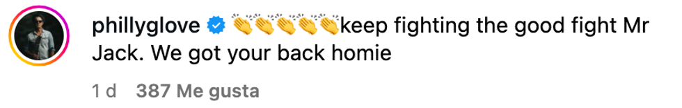 @phillyglove/Instagram
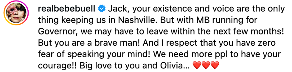 @realbebebuell/Instagram
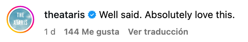 @theataris/Instagram
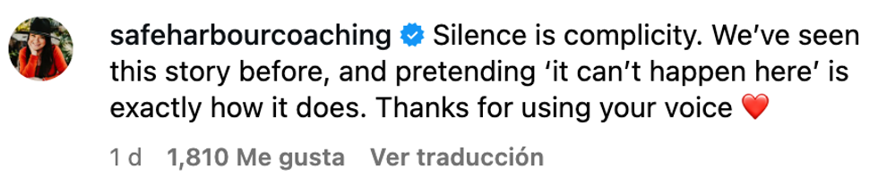 @safeharbourcoaching/Instagram